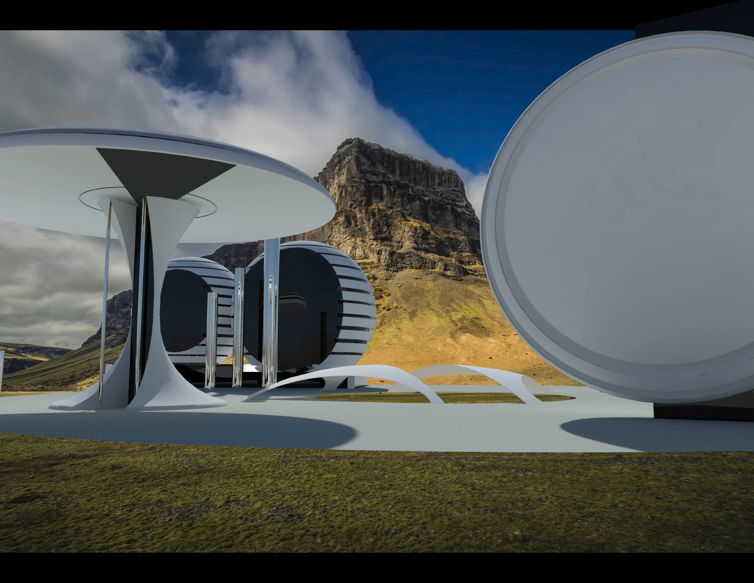
SPA
–
In Concept Phase
This will be a cutting edge “SPA” offering the latest in cosmetic surgeries and facial treatments, combined with cutting edge meditations and mind mending therapy. Clients will be able to stop in and get a 15 min recharge for the day. Looking forward to the first locations opening.
FRENCH CONNECTION
–
This older building needed a face lift for the store front and a complete rebuild for the inside. The store is 2 stories with a 3rd floor for private shopping and shows.
MOE'S HOME
–
This is a 3 storey store which is inclusive of 48,000 sqft. The store remained open during the entire renovation and was phased to allow the business to remain open. This client has very cutting edge products and has a strong design presence. The store was created to house a vast variety of styles yet to be as cutting edge as the product it self.
We continued to work with Moe's to create a new design in his Vegas location.
THE STYLE LAB
–
Salon Flagship
This was the first location for this client, we were directly involved in the branding of this company which now has two locations in Vancouver.
TIARA JEWELRY
–
New Fresh Look
This Jewelry store was previously renovated, however, the owner was not satisfied with the outcome. We came in and tweaked a few things, unified the look and even added some space for new showcases.
RE-BRANDING CLIENT
–
FURNITURE SETS
I was hired originally by this client to fix the disaster of a renovation they paid for, after making their home amazing, the client asked me to help re-brand his company image. I was asked to come up with unique ways to showcase his flooring line. In total we did 56 shoots, getting well over triple that in images for his to use to re-brand. Some shoots we done at a set and some where done at site.
IDS WEST SHOW
–
CLIENTS BOTH
This client has an unlimited amount of products, and they are very fashion forward for the market they sell to. I had very tight budget and wanted a massive impact. We hung furniture from the ceiling to create the impression of a roof and close off their massive both, and mirrored the furniture for a “living room set “ and yes just cause we could do it. It definitely was a show attraction.
UNIVERSITY
–
In Concept Phase
Client wanted a school that would inspire to learn, that the buildings and campus would inspire those that went there to grow mentally beyond just academics, as the world of education changes , our schools need to do the same. This really is starting and is being developed.


